👋 Hi, I'm Ryan Ponder
Data Analyst | Business Analyst | Financial Analyst
🏠 Mortgage professional turned data analyst
💻 Excel, Tableau, SQL, Python, R
🎸 Musician,🧘🏼 Yogi, 🍳Chef
📍 Columbia, Missouri USA
Technical Skills
SQL
Excel
Tableau
Python
R
Project Management
Projects
🍔 Food Delivery
Marketing Project
Excel | Exploratory Data Analysis
◾ Real world-marketing campaign data
◾ Using only Excel for analysis and data visualization
◾ Utilized VLOOKUPS, Pivot Tables, Scatter Plots, & Bar Charts
◾ Provided a comprehensive write up to help the marketing team on their next campaign
🏫 Evaluating School Success with Tableau Project
Tableau | Data Visualization
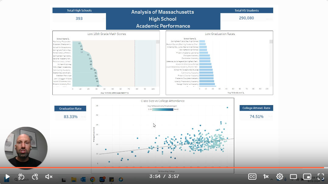
◾ Created dashboard evaluating 400 different schools' performance across 100's of features
◾ Used Scatter Plots, KPI's, Bar Plots, & Area charts to show performance differences
◾ Presented dashboard to stakeholders via recorded video
About Me
👋 Hi, I'm Ryan & welcome to my portfolio! As a data analyst with a passion for turning raw data into actionable insights, I thrive on solving complex problems and making data-driven decisions. My background combines a strong foundation in statistical analysis, data visualization, and programming, enabling me to dissect large datasets and uncover meaningful trends.I am always eager to learn and adapt to new tools and methodologies, continuously honing my skills to stay at the forefront of the ever-evolving data landscape. My goal is to leverage data to drive efficiency, optimize processes, and contribute to the overall success of the teams I work with.I'm proficient in analyzing data with:
- Excel
- Tableau
- SQL
-Python
- RI love being able to help a company extract insights from their data. If you'd like to contact me, feel free to Email Me or connect with me on LinkedIn!
🏫 Evaluating High School Performance With Tableau Project
In the state of Massachusetts, there are approximately 290,000 high school students across nearly 400 high schools. That means that one fourth of the state's 1800 schools seek to educate these grade levels.
Background
The state of Massachusetts wanted to analyze their school performance data. The Department of Education wants to know how high schools are performing across several key metrics and how they can best allocate funds to assist the schools that need it most.They wanted to know:
◾Which schools have high graduation rates
◾How do math scores impact students graduating
◾Does class size impact college attendance
◾What impact does the percentage of economically disadvantaged students haveUsing Tableau, I took a deep dive into the data to help find the answers to these questions and you can follow along in the video below!All the data is available to look at yourself on this Tableau DashboardThe original dataset can be found here 👉 Dataset
Analysis
It was amazing to learn that the statewide graduation rate is 83% with nearly 75% of those graduates going on to college or university.The state wanted to know which schools were not performing to standard in math on the Massachusetts Comprehensive Assessment System (MCAS). Ideally the state would like to see majority of students scoring proficient or advanced and all but 27 schools hit that mark which is great!
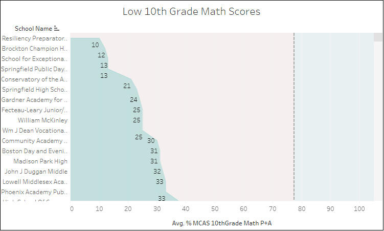
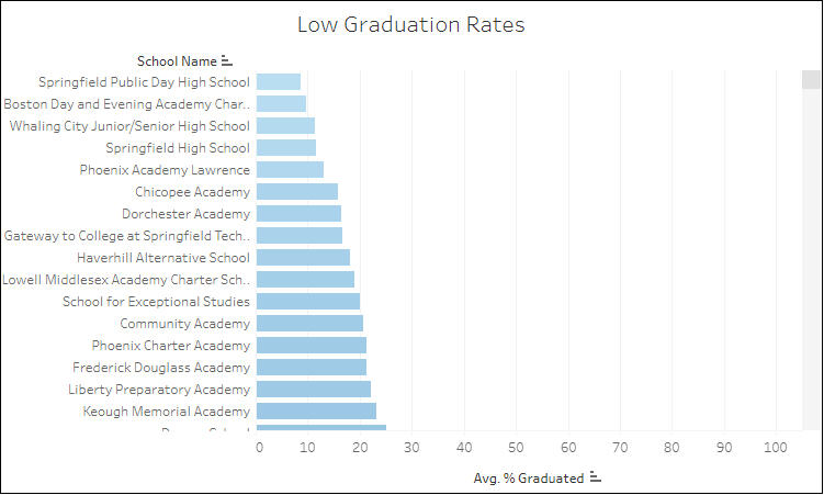
Next, I wanted to look at how the math assessment related to graduation rates.Of the top 5 schools with the lowest graduation rate, 3 of them, Springfield Public Day High School, Boston Day & Evening Academy and Springfield High School also have some of the lowest rates of students performing to standard on the MCAS.
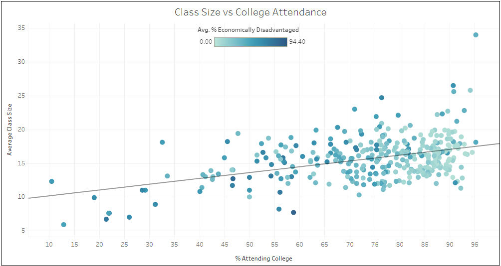
I then wanted to identify what role, if any, class size plays in students going to college or university post graduation.There did not appear to be a strong relationship between these two variables as the variance is only 19% which was honestly a little surprising as we thought that classes with a higher density of students would potentially be impacted negatively in that regard.Lastly, we found the most helpful piece of information!When it comes to schools that are struggling to graduate their students, the population of students considered by the state to be economically disadvantaged is 75.52% on average. That is really eye opening when looking for ways to help some of the schools that aren't meeting the mark!
Conclusion
Through this analysis we were able to provide the Department of Education with a great tool to share with schools to gain insight in performance.I would suggest continuing to dive into the correlation between MCAS scores and other academic progress metrics on a district level and across all ages to further gain insight on which districts are excelling and which may need some additional resources.I would also explore programs to assist schools with higher rates of economically disadvantaged students as we were able to show that there is a strong correlation between the percentage of that population and school performance.If you enjoyed reading this. Please connect with me on LinkedIn. I'll be posting more like it. This project was done as part of the DAA Boot Camp Projects. Educational purpose.
🏀 2023 & 2024 NBA Statistical Analysis🏀
I created a tableau story to aid in visualizing the season from a statistical stand-point that accompanies this analysis. You can find that here: 2023/2024 NBA Tableau Project.
A TABLEAU PROJECT WRITE-UP
Every season tells a story. With the NBA season approaching, I wanted to look at the story told throughout the 2023/2024 season. The season culminated in the Boston Celtics claiming their 18th championship while Nikola Jokic of the Denver Nuggets earned his 3rd Most Valuable Player honor.However, these are only a fraction of the story. I wanted to dig deeper and uncover how the season unfolded and where those pieces fit into the larger picture.My analysis provided some intriguing insight into the season. I found things like:🏀 Nikola Jokic scored around 200 points less than the 2nd and 3rd place vote getters in the MVP race, Shai Gilgeous-Alexander and Luka Doncic.
🏀 The Indianapolis Pacers scored the most points on the season at 10,118. That’s 1,401 more than the lowest scoring team, the Memphis Grizzlies who scored 8,717 points.
🏀 There is not a wide gap in 3 point percentage with the exception of a couple of outliers, the Charlotte Hornets and Cleveland Cavaliers centers.
🏀 The point-guard position accumulates the most assists by position group with Dennis Schroder leading the charge at 976 assists on the season.
THE DATA
This data is available from Basketball Reference, and can be found here: https://www.basketball-reference.com/leagues/NBA2024totals.html.The data contained around 30 attributes for just over 500 different players. I primarily focused on the following:PLAYER: Player NamePOS: PositionTM: Team3P: 3-Pointers Made3PA: 3-Pointers Attempted3P%: 3P/3PATRB: Total ReboundsAST: AssistsPTS: Total points scoredIn the data, there are a few instances of duplicate player names. This is primarily due to players being traded mid-season. When this happens, the player also has a combined record, 2TM (2 team), which is the sum of all teams that player was on for the season. To account for this, I filtered out the 2TM record for players that were on multiple teams.To give a little context to the roles that each position plays, we can take a look at the following chart along with a brief overview of each position provided by nba.com.
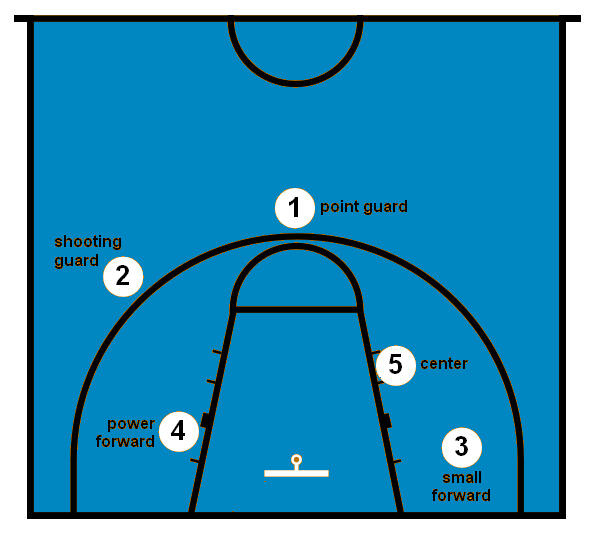
1. Point guard (PG) - The point guard runs the offense and usually is the team’s best dribbler and passer. The point guard defends the opponent’s point guard and tries to steal the ball.
2. Shooting guard (SG) - The shooting guard is usually the team’s best shooter. The shooting guard can make shots from long distance and also is a good dribbler.
3. Small forward (SM) - The small forward plays against small and large players. They roam all over on the court. Small forwards can score from long shots and close ones.
4. Power forward (PF) - The power forward does many of the things a center does, playing near the basket while rebounding and defending taller players. But power forwards also take longer shots than centers.
5. Center (C) - The center is the tallest player on each team, playing near the basket. On offense, the center tries to score on close shots and rebound. But on defense, the center tries to block opponents’ shots and rebound their misses.
POINTS BY POSITION
I started my analysis by getting an idea of how much teams were scoring (PTS) and where those points were coming from (POS). I created a stacked bar chart that shows the total scoring by team and then used the position groups as subcomponents within the team’s total points.
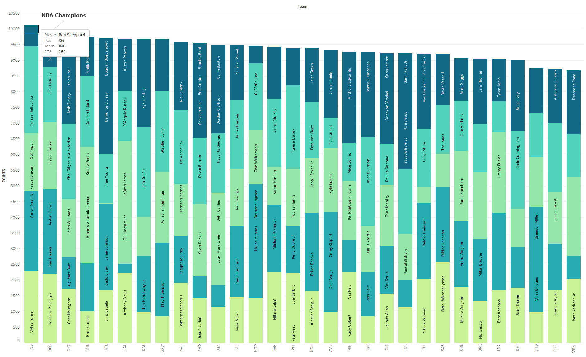
It’s no surprise that the NBA Champion, Boston Celtics, are towards the top in total points scored. From there it’s a steady decline until the bottom 3 teams. Charlotte, Portland & Memphis all scored around 1500 fewer points than the leading team, the Indiana Pacers.
3 POINT SHOOTING EFFICIENCY
Since the three point shot was introduced into the game in 1979 the number of 3s taken and the efficiency of which they are scored has steadily risen. In 1979 the average number of 3PA was 2.8 per game. Fast forward to our data from the 2023/2024 season and the average number of 3PA was 39.39 per game.I wanted to see which teams and position groups were more efficient in their 3 point shooting. I created a heatmap that details the 3 point percentage by position broken down by team.
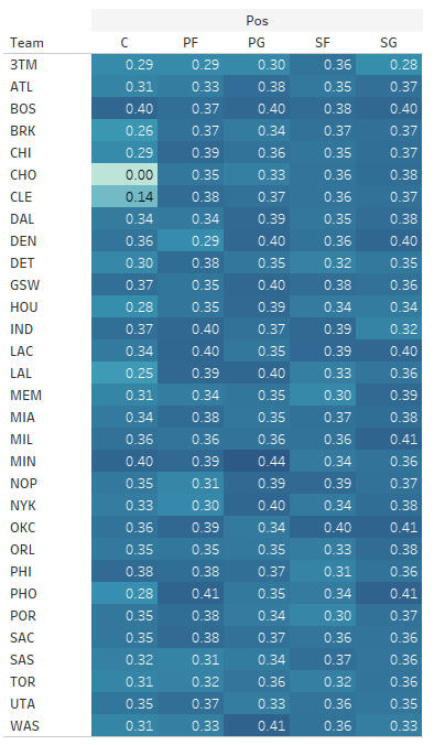
What I found here is there isn’t a clear front runner like I thought there would be. The point guard position in Minnesota (MIN) sticks out for shooting the 3 at a 44% efficiency. Conversely, there are a couple of pretty big outliers in the center positions for Charlotte (CHO) and Cleveland (CLE). Both are shooting well below average which appears to be in the mid 30% range across the league.
ASSISTS BY PLAYER
Scoring rarely happens in a vacuum. Being that basketball is a team sport, it usually takes more than one team member to score. An assist (AST) is a statistical indicator of that teamwork. I created a treemap to show total assists categorized by position.
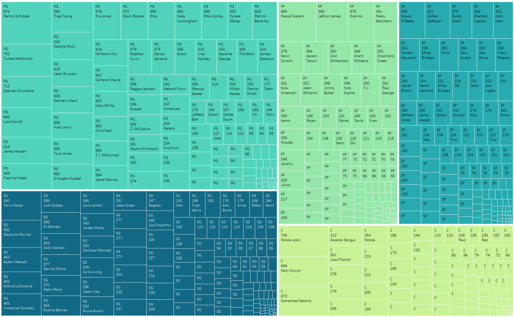
As mentioned previously, the point guard’s primary role is to run the offense and distribute the ball. We see that hold true throughout the season with the point guard section occupying the most space. The shooting guards are not far behind while power forward/small forwards appear to record roughly the same number of assists.
OVERALL PLAYER PERFORMANCE
The NBA championship is a goal for most teams at the start of each season. On the individual level, the Most Valuable Player (MVP) award is awarded to the player that performed the best throughout the season. Nikola Jokic was awarded his third MVP award for the 2023/2024 regular season having won previously in 2021 & 2022.I wanted to gain insight on Jokic’s performance in relation to other players that may have been in the running for the award. To do this, I created a bubble plot that shows every player’s points, rebounds & assists for the season.
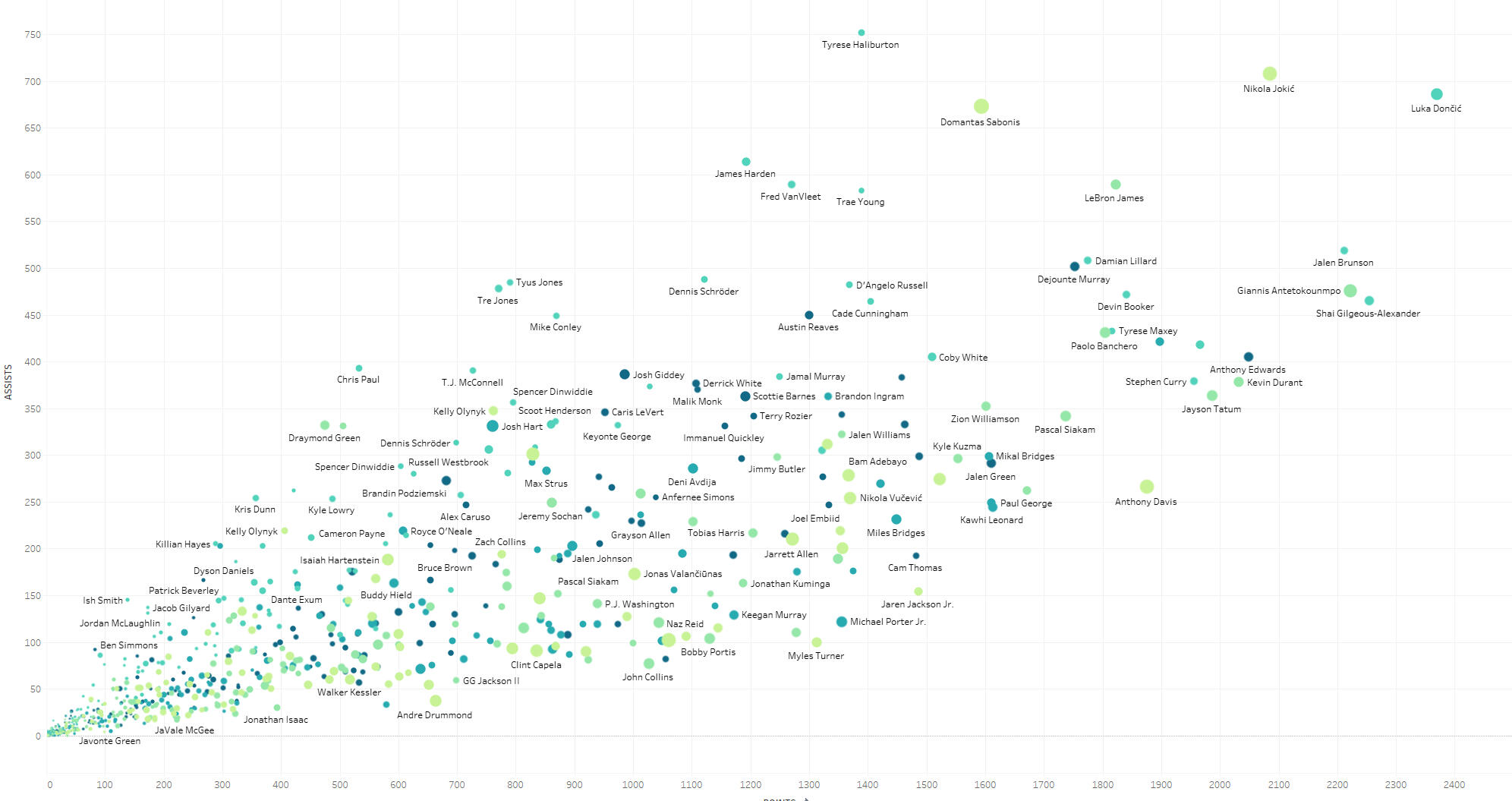
What is interesting here is that Jokic is not the statistical leader for any of the three categories. He was 5th in scoring, 2nd in assists and 3rd in rebounds. What is evident, however, is that all players in the running for the MVP award (which includes Luka Doncic, Jalen Brunson, Shai Gilgeous-Alexander and Giannis Antetokounmpo rounding out the top five) are clearly outliers compared to the rest of the players in the league.There is the human element in the award as it is ultimately voted on by key members of sports media (writers, broadcasters and personalities) but the data supports Jokic as a well deserving recipient.
A SEASON TO REMEMBER
The amazing thing about data in sports is the abundance of information that is readily available. The stories I have highlighted here are just a few of so many narratives that can be uncovered through analysis. With every season, there are new and exciting ways that data can be used to tell the larger story or drill down to the finer points that would otherwise be missed.If you enjoyed this project feel free to connect with me on LinkedIn or check out my profile at www.ryan-ponder.com.


